BLOGGER TEMPLATES AND TWITTER BACKGROUNDS

Monday, 30 November 2009

Editing

Once we had finished filming it was time to start editing. We imported the footage we wanted to use into i-movie and started with our film trailer. We put the scenes in order of how we were going to use them and cut them to the lengths we wanted. We then placed them together using our storyboard as a constant reference. Once we had the shots together it was time to add transitions to smooth out the jump in-between shots. We added a fade between the shots as it was the simplest transition we could find. We then began to add affects to some of the shots to make the trailer look a lot more professional. We added an old style film affect to the girls praying scene, repeating this twice in the final trailer.

When we had finished with our film clips we started on credits. We produced are own production logo's like those seen in real movie trailers. The first, is for a fictional company called film works, we used an italic font for the first part of the name making the logo look extremely soft contrasting with the bold font used for 'works'. We kept the black, white and red colour scheme to connote the horror genre.

The second, a logo for company 'Low films' uses a bold font throughout the logo. By adding a white drop shadow we were able to produce a bold eye catching production logo. We added both these logo's to the beginning of our trailer to make our final work look more realistic.
Finally we added the films name 'Ward 13' to the end of the trailer so the audience would know the films name, we also added the films release date.


When the editing was done it was time to add in sound. Originally we tried to use garage band but found it hard to produce the sound we liked. In the end we decided to use some non-copyrighted music from www.freeplaymusic.com. We picked a sound track called 'Abandoned infirmary' which gave the trailer a creepy atmosphere. We then added screams to the end of the trailer to finish off.

Sunday, 29 November 2009

Filming

One we had finished planning we were ready to start filming. We filmed over a two day period, shooting after school at each different location. For our first shot we headed to Whittington hospital, we needed a close up of the hospitals sign to give the viewer a basic understanding of the trailers storyline. We decided to shot free hand as if the sign is being seen from the killers perspective. We then moved across the road to the Archway campus to film the hospitals establishing shots. Although the campus isn't actually a hospital because of its gothic architecture we thought it would be the perfect location for 'Ward 13'.

Our second location was Hampstead heath. These shots took a lot longer as we had more to film. Firstly we filmed the running shots, we got Yann to run around the camera whilst we tracked him. We did this as it was the most efficient way to get long running shots without taking the camera off the tripod. We then shot the girls praying scenes in a hidden corner of the heath. We placed red candles around the area and started to film. By zooming in on the candles we were able to create a very sinister shot. We then shot the killing scenes making the villain run up behind the girl. we shot this at a low angle to show the power the killer has over the viewers.

Lastly we shot a close up on the killers face whilst blood was being thrown over him. Again we shot this at a low angle with the killer looking down on us. With this shot we waited until the blood dripped off the mask before we stopped filming for the day.

Thursday, 26 November 2009

Magazine Cover, Planning and Production

The magazine was the final production piece we had to create. Having already taken the images when producing the film poster it became a matter of just picking the photograph we wanted to use. In the original storyboard we had planned on using a mid shot so we could incorporate the killers bloody shirt. By taking the image form a low angle we were able to draw more attention to the costume connoting the idea of slasher horror. When we had selected our image, a flat plan was created to give a rough idea on where everything would be placed. We also wanted to have a basic idea of the conventions we were going to use in our production work.

-Flat plan -


-Original Image-
Once we had chosen the final photograph we had to import it into adobe Photoshop to start editing. We played with the brightness of the image to give it a sinister look, then adjusted the colour making the red tones a lot more vivid. As a group we decided on the name film weekly , a simple yet clear name denoting what the magazine is about. We then looked at the typography of existing film magazines to help decided on our on font. Eventually we picked a font called aharoni adding a red drop shadow to create a 3D effect. We ended up putting our image over the top of the magazine name to show the films importance. Also by doing this it shows the magazine is a well known publication and that the content is a lot more important then the magazines name.

We added the films name 'Ward 13' to the bottom of the magazine keeping the same font as in the poster, this was to make sure our publicity campaign was consistent with each other. We then placed article names on each side of the image making the main headings white and descriptions red. This contrasts with the magazine title using the same colour scheme throughout. We then placed an emboss on the headings to make them stand out against the white shirt in the background. Because the articles relate to the horror genre we decided to make our magazine a 'Special horror edition' allowing us to focus purely on making out magazine a focused on the genre as possible.

To finish off we added a barcode, date, website and price (£3.00).


-Final Magazine-

Friday, 20 November 2009

Film Poster, Planning and Production

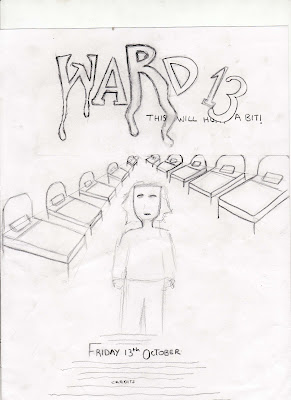
As part of our publicity campaign, we had to produce a film poster to help advertise the film. To begin design work we looked at some pre-existing film posters to help gain a understanding of the conventions used in normal posters. We created a spider diagram of the different concepts we wanted to include in our poster and came up with a final flat plan.

-Flat plan-


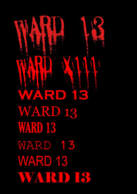
Once we had produced the flat plan we showed it to five 15-19 year olds, asking what they thought of the design we came up with. The feedback we received was mainly good except when it came to the typography. Most of the teenagers we asked agreed that the font should be bolder, so it would stand out on the page. This meant scraping the original idea of using an italic, blood dripped font for the films title. Using adobe Photoshop we was able to put all the elements we originally planned into the poster. Downloading a font from www.dafont.com produced a bold, yet chilling title fitting the slasher genre. The tagline "this will hurt a bit" is a commonly used phrase by doctors and connotes the idea of pain suggesting the film may 'hurt' the viewer. We used a font called ariel bold for the tagline, placing it directly under the films title 'Ward 13'. Both title and tagline are written in red representing blood, denoting the slasher genre.

In the background we used a black and white image of an old hospital ward. After we had figured out the background we started out on main image. We planned on using a long shot of the main character David Slash standing with his arms caught in a straight jacket. For this we took a number of images at different angles to capture the perfect picture. Once we were happy with the image we used a filter to add an artist stoke and blur the image. We then cut the image form its original background placing it in the centre of the hospital photo. In addition we blurred the edges to make the image consistent with the background.

-Original Images-


Finally we added the films release date and production information to the bottom of the poster. Again we used ariel bold for the release date to keep consistency in the poster.


-Final Poster-


Thursday, 19 November 2009

Publicity


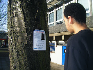
We wanted to see people reactions to the storyline we had come up with so we produced this publicity poster. This poster is designed to look like a metropolitan police poster warning people of an escaped crimal. We placed the poster around are local area to see the reaction it would cause. We based this idea on the publicity campaign for film District 9, which featured posters warning people of alien attacks. These poster were posted in certain locations featuring the words 'Humans only'. We also looked at the publicity campaign for The Blair witch project. Artisan Entertainment created a hugely successful publicity campaign, creating missing posters for the films characters.