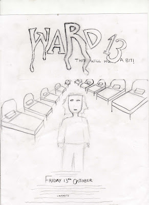
As part of our publicity campaign, we had to produce a film poster to help advertise the film. To begin design work we looked at some pre-existing film posters to help gain a understanding of the conventions used in normal posters. We created a spider diagram of the different concepts we wanted to include in our poster and came up with a final flat plan.
-Flat plan-

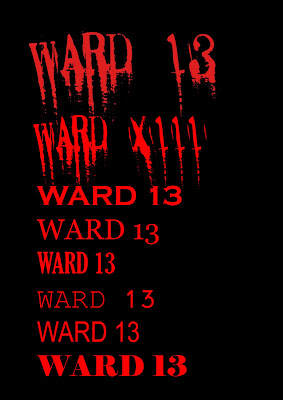
Once we had produced the flat plan we showed it to five 15-19 year olds, asking what they thought of the design we came up with. The feedback we received was mainly good except when it came to the typography. Most of the teenagers we asked agreed that the font should be bolder, so it would stand out on the page. This meant scraping the original idea of using an italic, blood dripped font for the films title. Using adobe Photoshop we was able to put all the elements we originally planned into the poster. Downloading a font from www.dafont.com produced a bold, yet chilling title fitting the slasher genre. The tagline "this will hurt a bit" is a commonly used phrase by doctors and connotes the idea of pain suggesting the film may 'hurt' the viewer. We used a font called ariel bold for the tagline, placing it directly under the films title 'Ward 13'. Both title and tagline are written in red representing blood, denoting the slasher genre.

In the background we used a black and white image of an old hospital ward. After we had figured out the background we started out on main image. We planned on using a long shot of the main character David Slash standing with his arms caught in a straight jacket. For this we took a number of images at different angles to capture the perfect picture. Once we were happy with the image we used a filter to add an artist stoke and blur the image. We then cut the image form its original background placing it in the centre of the hospital photo. In addition we blurred the edges to make the image consistent with the background.
Finally we added the films release date and production information to the bottom of the poster. Again we used ariel bold for the release date to keep consistency in the poster.
-Final Poster-


0 comments:
Post a Comment